The Evolution of the Brand
The L.A. Kings located at 555 N Nash St, El Segundo, CA 90245 have revealed a brand evolution with modern team logos and graphic components.
Here are some salient points on the Best Logo Designs in Los Angeles:
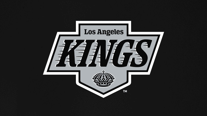
- New Primary Mark: The centerpiece of the rebrand is the new primary logo. Inspired by the iconic 1988 logo, which aligned with the Kings’ signing of hockey great Wayne Gretzky, Subtle variations in the revised form modernize the design and honor the past1.
- Iconic Elements: The new design reinterpreted the recognizable Kings emblem from 1988 to 1998. It also has a revised form of the team’s 1967 first season’s original “Kings Crown”.
- Brand Font and Color Palette: Alongside the logo, the Kings introduced new word marks and an updated color palette. Look out for the striking “enhanced silver” on their new jerseys1.

A Brief Logo History
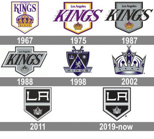
The Kings’ logos have evolved over the years, reflecting different eras and organizational shifts:
- 1967–1988: The early years saw various logos, but it was the shift to black, silver, and white in the 1980s that marked a pivotal change. The team’s inaugural logo was a simple yet regal crown, reflecting the Kings’ royal theme. The colors purple and gold were predominant, symbolizing luxury and grandeur. The Kings embraced this look until 1982.
- 1988–1998: The iconic logo during this period featured a stylized crown and bold typography, switching the team’s colors to black and silver. This bold new look aimed to project strength and modernity. It was a time of growth and excitement, especially with Wayne Gretzky leading the team1.
- 2011–Present: In the 2011–2012 NHL season, the Kings adopted their current logo. A sleeker, more minimalistic version of the shield was adopted, emphasizing the team’s dynamic and clean aesthetic. It brought back the cherished black and silver, reinforcing their hockey identity and connecting to their successful early ’90s era3. Their latest logo combines elements from past designs with a fresh, modern touch. It symbolizes the Kings’ forward-looking approach while respecting their storied past.
Celebrating the Legacy
The LA Kings’ brand evolution celebrates their rich legacy while setting the stage for future iterations. From Gretzky’s era to the present, the Kings continue to be a pillar brand in the hockey world. Fans can now purchase new Kings merchandise at the Team LA Store, where history and modernity collide1.
As a branding agency specializing offering the Best Logo Designs in Los Angeles, we understand the importance of a logo in representing a brand’s identity and values. The L.A. Kings’ logo evolution showcases the power of strategic rebranding and its role in staying relevant and engaging with the audience.
Our team at Branding Los Angeles is dedicated to helping businesses create impactful logos that tell their unique story. Whether you’re looking to refresh your brand or develop a new logo from scratch, we offer tailored design solutions to meet your needs.
Contact us to elevate your brand with a logo that captures your essence and appeals to your target audience.


