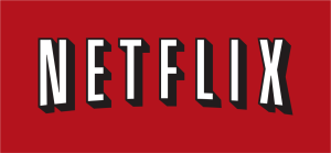
Netflix has taken a new direction towards branding and has surprised us with the unveiling of a new logo.
This new logo consists of a narrow capital “N” with a black background. When looking at this fresh logo, you can imagine a red ribbon that folds over itself. According to the company, the well-known “Netflix” banner logo is not being replaced. Instead, this new logo will be used on things such as apps, social media, and other “product integrations in the near future.” For now, we do not know the reasoning behind this change since Netflix has refused to comment much on it.
 When a company makes major changes in their branding, it is very difficult to receive positive feedback. For example, when Instagram completely changed its logo and logarithm, everyone was dissatisfied. Recently, Uber has also updated their logo and received the same negative feedback; because, the new logo reminded many of a vector for a computer program.
Surprisingly, Netflix has been receiving encouraging feedback from the Twitter community. Many have made positive comments, such as “Not to shabby” or “I dig”.Because the new logo leaves less negative space in devices with smaller screens, like smartphones, Netflix will be easier to identify when placed next to other apps. This new addition to the brand is also receiving positive reviews, because Netflix needed a square format logo to be used for social media.